


POP! Hotels are about to introduce to the customers a new concept named PITSTOP which is a series of signature snacks related to the eponymous brand name such as: POP!corn, POP!sicle and many more. In addition to this, the brand changed their logo color to light green to an eco-friendly approach.
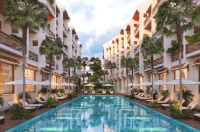
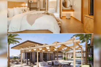
JAKARTA – Since its first public appearance in 2010, and eighteen hotels across Indonesia later, POP! Hotels keeps on innovating over time in order to better cater to the ever-changing market trends – this time introducing PitStop, an all-new lobby and living space experience offering a fun blend of Café + convenience store.
“With a warmer interior atmosphere combining upcycled and recycled elements to reflect the brand’s eco-friendly concept, PitStop is designed to become a public and interactive social hub for young business professionals and millennial travelers,” said Irene Janti, TAUZIA’s Chief Brand & Product Officer.

PitStop will operate 24 hours a day and feature POP! Stacks – a series of signature snacks related to the eponymous brand name such as: POP!corn, POP!sicle and many more! In addition to that, it will also offer various dry food, rice boxes, sandwiches, pastry, local delicacies, pastas, hot beverages and soft drinks.
Another important element of PitStop will be the versatile seating arrangement, which is adjusted to bring up a more loungy ambiance.
“We want to create an inviting and easy going venue to reflect the dynamic spirit of the young and vibrant new generation, and with a blend of eclectic furniture, we believe both business and leisure travelers will feel comfortable hanging out with their peers anytime they want to,” added Irene Janti.
A New Logo Color for the New Era
In conjunction with the release of the new PitStop concept, POP! Hotels will also introduce a new logo color effective immediately for all communications pertaining the new hotel concept. The dominant color will remain the same, as the choice of green is to represent the brand’s commitment to an eco-friendly approach.
“Previously POP! Hotels has been renowned for its playful spirit with the color blend of green and a touch of orange, capturing the essence of youth and cheerfulness. Now with an infusion of blue color – the new logo will signify the brand’s added maturity, as well as consistent dedication to product improvement in answering the trends and market changes,” said Zulner Nouradine, Brand Manager of POP! Hotels.
Furthermore, the new logo also marks a change in the sales and marketing strategy as POP! Hotels will now focus on a competitive room-only rate, while offering various F&B offers as complementary attraction.
The new hotel logo will be applied starting with the upcoming POP! Hotel Pasar Baru Jakarta, followed by other openings to be revealed in the months to come.

Theodore is the Co-Founder and Managing Editor of TravelDailyNews Media Network; his responsibilities include business development and planning for TravelDailyNews long-term opportunities.